
Scratch's Accessibility Updates
During 2021 and 2022, I led the design and development of a new set of accessible colors for Scratch Blocks, which were applied to the editor's navbar and the entire website. These changes were launched in Summer 2023.
Business Goal & Success Measures
Maintain Scratch's website, platform assets and components to ensure accessibility and ease of use. As a quick off, our project primarily focused on modifications to Scratch’s iconic code blocks.
Reduce complaints directed to our 'Contact Us' team, improve the experience for teachers by providing options for projector use in class, and enhance Scratch's accessibility for a wider user base according to W3 guidelines.
Context: Scratch's editor page
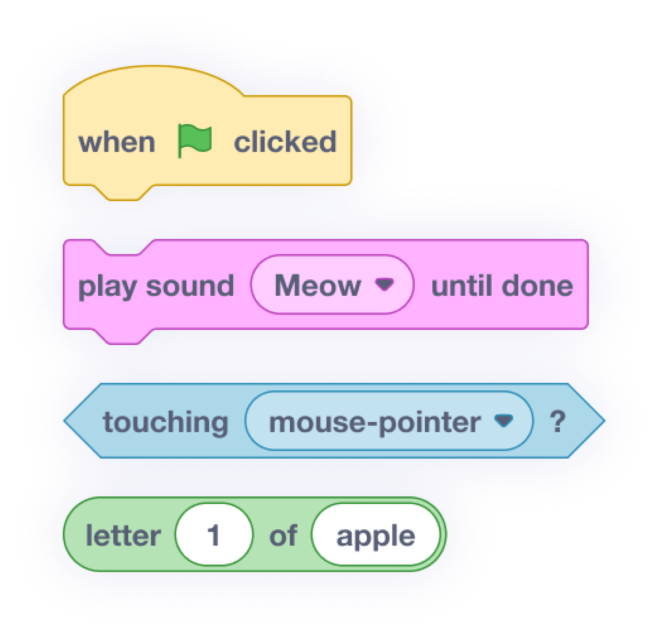
Scratch is a free programming language and online community where Scratchers (i.e. young Scratch users) can create their own interactive stories, games, and animations. Scratchers primarily work with the editor page, using Scratch blocks to develop their creations.
The problem: Scratch's blocks do not have good color contrast
Our team understood the importance of creating a welcoming environment for everyone and decided that one of its goals for 2023 was to make the website and Scratch app more accessible.
Our team identified that the color contrast between Scratch blocks and their respective text did not meet the requirements of the W3C Web Accessibility Guidelines.
Additionally, we received input from Scratch's internal accessibility committee, led by a person with low vision, and the community, including messages from users and teachers, reporting that students with low vision were having trouble reading the blocks in class.

Current Color Ratio:
Between 1.47:1 to 3.29:1
Goal: Improve contrast between block colors and text
We also acknowledged that the rest of the website needed updates, but due to urgent need and staff reductions, we decided to focus solely on updating the blocks in version one. The blocks represented the most complex usage of color in our UI, and their colors were used throughout the rest of the brand. By solving the color contrast problem for the blocks, we could create a solution that could be applied elsewhere on the website.
At the time, the contrast ranged from 1.47:1 to 3.29:1. According to W3C standards for accessibility, our color contrast ratio should have been more than 4.5:1.

Ideal Color Ratio:
More than 4.5:1
Challenges: Things we had to consider before implementing the changes
Block semantics
Both new and experienced Scratchers rely on color semantics while learning and using Scratch. The color of the blocks conveys particular meanings and are associated with different functions.
For example, all blocks associated with Events functions are yellow.
This means that simply adjusting the contrast by darkening the yellow color or changing the color of the block altogether is not an option, as it would affect how users relate to the function—similar to changing the colors of a traffic light.

Scratch's branding
Scratch's colors have characteristics that make the brand unique, recognizable, and welcoming to a wide range of users. We need to maintain a look and feel that does not bias towards any particular audience. For example, the design should not feel too young or too technical.
Spectrum of low vision
There is a range of low vision low vision, and each person has their own particular needs.
Levels of contrast
There also exists areas of contrast between the stacked blocks and the white area where they are located on the page. We need to ensure that our changes also account for the contrast between assembled blocks.
Process: Technical considerations and kicking off the project
To start, with parameterization in mind, I designed the blocks using Figma, ensuring future use would be more efficient. I then integrated them into our design system, enabling precise color adjustments, exploration, and comparisons. Utilizing a contrast plugin, I could efficiently check and tweak colors to meet accessibility standards.

I also adhered to Scratch's Brand Guidelines Color System to ensure consistency and harmony across the colors. We maintained hue and saturation for each category while adjusting lightness. The design team led a brainstorming workshop with the internal team to gather further insights. From this session, we developed some guidelines for implementing the changes across the blocks and text:
White text – Works only with darker colors
To achieve W3C approved color contrast levels with white text, we would need to drastically change the color, which would result in the color differing too drastically from its associated function, resulting in losing its intended meaning.
Black Text – Will need a 7:1 Ratio adjustment to pass accessibility guidelines
Because people use Scratch in different environments (such as on small screens or in varying light conditions), these factors can affect how they see the blocks. Therefore, instead of keeping the color contrast at a minimum of 4.5:1, we decided to maintain a contrast ratio of at least 7:1.

"The 7:1 level (...) generally provides compensation for the loss in contrast sensitivity experienced by users with low vision who do not use assistive technology and provides contrast enhancement for color deficiency as well."
Black text – Provides better contrast with the current colors
Black (#000000) is the darkest color we can use and is most likely to work well against many colorful and bright backgrounds.


Getting insights from users
To widen the range of feedback geographically, we conducted virtual usability tests and playtests. Playtests are a more informal type of usability test that involves observation and heuristic analysis. We used screen recordings when possible and received positive feedback from both students and educators. This approach also helped participants feel a sense of ownership throughout the design process.
Usability tests
I had the opportunity to conduct tests with users from rural areas of Brazil and from diverse socioeconomic backgrounds. These usability tests were recorded, and I later turned them into an extensive document that I shared across the team to help facilitate conversations about the project.
Playtests
We began by identifying educators who work with our target audience from Scratch's list of partners and conducted tests with groups of low vision students.
Planning these virtual tests involved coordinating school and class schedules, obtaining media release forms, gathering resources for teachers, and accommodating the unique needs of each educator and student.
“Thank you for the opportunity. The kids really do like this design thing, it’s real, it matters.”
— educator
Survey: Testing with Scratch Lab and gathering feedback from a wider audience
We also used Scratch Lab as a testing environment, encouraging educators and Scratchers to try out the new high-contrast blocks. A survey was available in the editor for those who wanted to provide feedback. We received responses from over 800 participants, with 338 providing meaningful data.
Decision Making
We learned that people without visual impairments did not like the high-contrast blocks, considering them less aesthetically pleasing. However, the survey revealed that people with visual impairments preferred the high-contrast blocks. An incidental finding was that educators who used projectors in classrooms also preferred the high-contrast blocks, demonstrating a curb-cut effect.
“The Curb-Cut Effect is a vibrant illustration of how laws and programs designed to benefit vulnerable groups, such as the disabled or people of color, often end up benefiting all. That creation underscores a foundational belief: we are one nation, we rise or fall together..”
We also determined that we would have time to change other features on Scratch's website. Thus, I built an inventory of the entire site to detect areas lacking contrast on Scratch.mit.edu. I proposed applying the new colors to some of the pages. The biggest change was to the main Scratch site, which changed in color from blue to purple because purple is more color contrast-friendly in various applications. Finally, all these changes were added as tickets to Jira.
Takeaways
In the spirit of Universal Design for Learning (UDL), we decided that offering the option to toggle between block settings would be the best approach. Users can now choose to stick with the original colors or switch to the high-contrast version. This approach caters to the needs of those on the low vision spectrum and their particular needs, but also includes dyslexic users.
Outcomes
Business
This project is just one step on our journey toward making Scratch more accessible.
“Accessibility is something that we’re baking into every new thing we do here at Scratch while retroactively ensuring that what we have can also be made more accessible. Every month, our team meets with industry leaders in the STEM field to focus on accessibility and learn from others who may be further ahead.”
— Director of Design, Tif Gagnon
Professional growth
Importance of Accessibility: This project reinforced the importance of working with disabled people, considering the low vision spectrum, and the meaning of the phrase “not designing for us, designing with us."
Trust Internal Expertise: Due to Product Design's multidisciplinary nature, this project had an extensive research phase so we could ensure we were implementing the best updates, while also considering users, accessibility, brand, contrast, and company constraints. While we welcomed external insights and knowledge, I also learned when to stop seeking outside experts and make decisions internally, trusting that our team had the expertise in designing the blocks and their application.
Importance of Knowing When to Test (or Not): Tests are always valuable if you have the time and budget, as they can provide new insights. However, conducting tests without identifying their potential benefits to the final outcome is inefficient. My experience with different social and cultural groups gave me new perspectives on the product, which I documented extensively to share with my coworkers. However, these insights were not relevant solely to this project and had applications elsewhere.
Taking Risks and Decision Making: Given the relevance of this work, the team took responsibility for any potential problems we faced with the launch. Sometimes, the weight of this responsibility caused me to overthink the changes. However, taking risks is essential for positive change, and it was important for me to remember that pleasing all users is the exception, not the rule.